HAIKUMI
2023
Portland (remote)
2023
Portland (remote)
APP
Haikumi is a messaging app where you can only text in a haiku — in a 5-7-5 syllable count. I worked on this project while I was working as a designer at Wieden+Kennedy (W+K) in 2023. This project was initiated by a resident in the W+K residency program and I, along with 2 other designers (Mimi and James) worked on the branding and design for this app.

The logo is a combination of two typefaces, the first being GT America, a clean sans serif, and the second one I don’t remember the name of, but being a more traditional serif font creating an interesting play on the title. We visually decided to differentiate the words ‘Haiku’ and ‘mi’, changing the original pronunciation of the title and transformed the name into a playful invitation — Haikumi / haiku me.


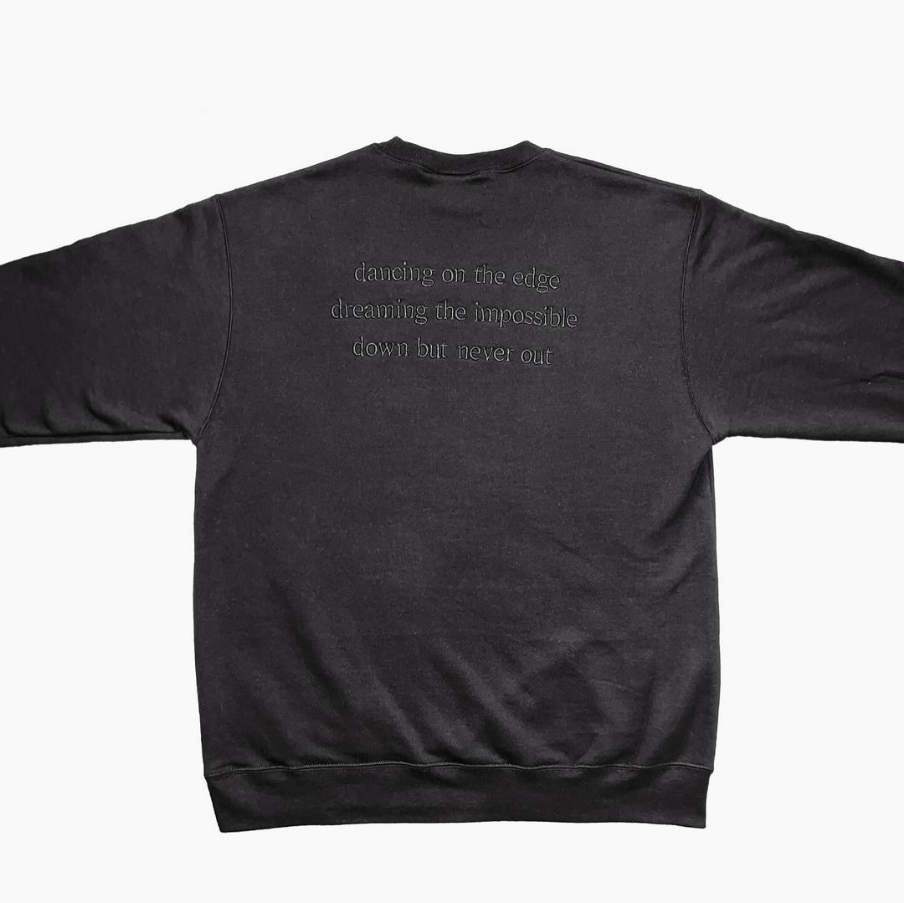
Above are examples of the branding we developed being applied to a sweatshirt for Haikumi merch.
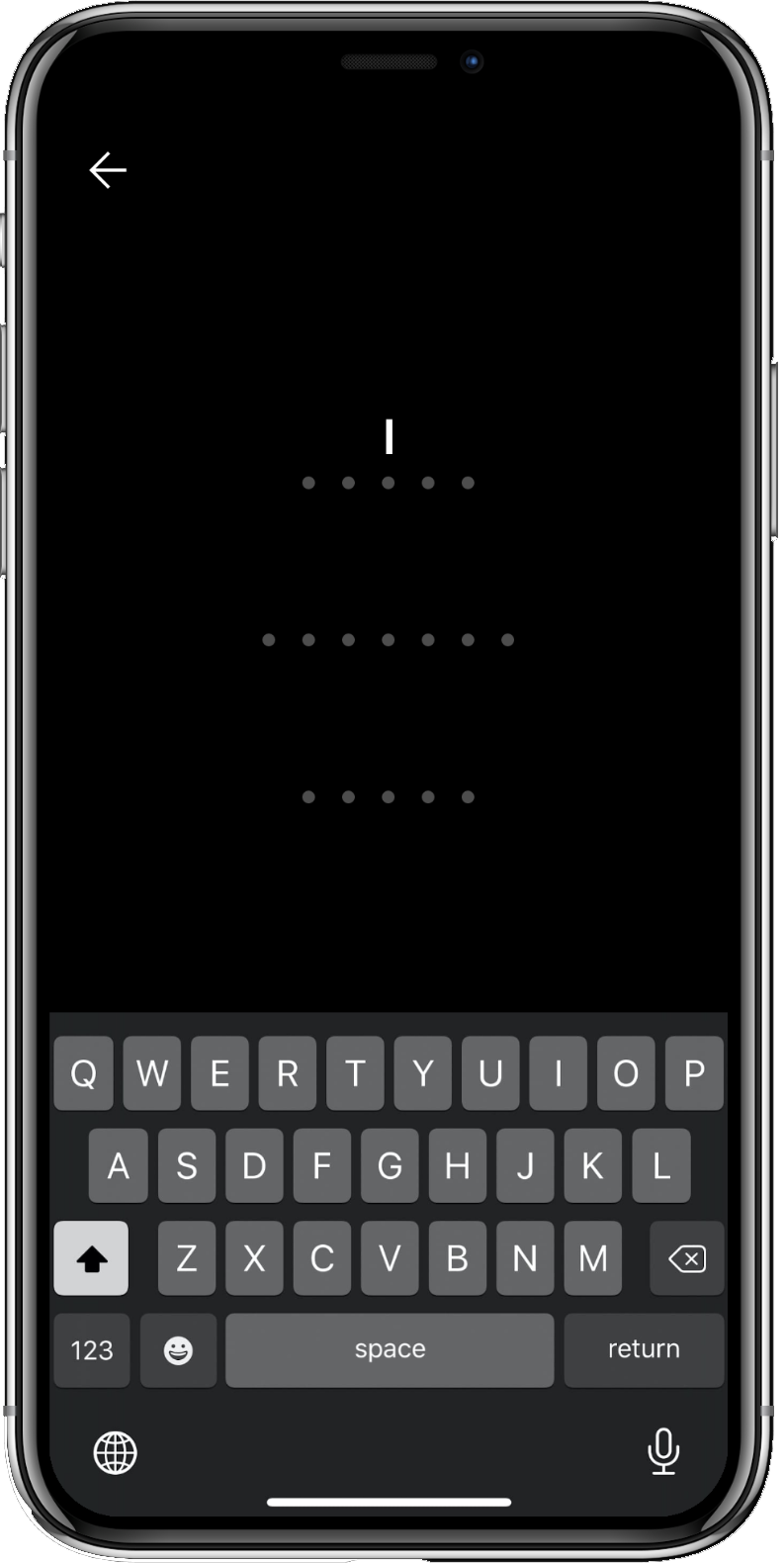
The icon we designed for Haikumi is a play on the iOs messaging icons and the 5-7-5 syllable count; changing the standard use of iOs’ 3 dots to 17 dots broken up in 3 rows.


The dots becomes a very important element for the branding for Haikumi. It is used on the app to help users navigate their syllable count. A thoughtful solution to improve the user experience.
Above is content created by the Haikumi team using the branding we developed. Early on in the design process, we established Haikumi as a black & white brand, meaning that all the core elements related to Haikumi, logo, typography and icons are to be in black or white. This kind of branding offers a product that is consistent and flexible. It goes with everything! Seamlessly, this branding integrates visuals we already recognize, and still, being able to create something new, with a strong look and thoughtful experience.